

Your ad crushed it. Your SEO delivered. The player clicked. Landed. Started exploring. But five taps in… they’re gone.
No deposit. No spin. No second chance.
“We see over 60% drop-off between signup and first spin on poorly localised mobile platforms.” — Bettorify Data Team
In Asia’s mobile-first markets, it doesn’t take a broken site to break your ROI.
Just a cluttered lobby. A loading delay. A deposit button lost in translation.
Poor mobile UX isn’t a design issue. It’s a cost issue.
Every confusing screen or slow scroll isn’t just a bad experience. It's a burnt CAC.
Let’s unpack some silent killers draining your first-deposit conversion, and what high-performing platforms do differently.

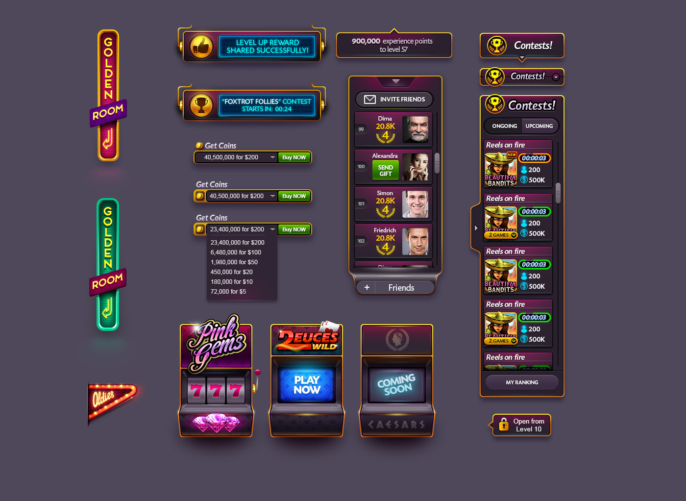
Hall of Shame: Real Examples of Common UX Fails
We’ve seen some things. So, we know about lobbies that look like slot-machine junkyards. Deposit screens that assume every player pays in dollars. KYC flows that feel like airport security.
Here are some of the most common UX mistakes that silently kill your first-deposit conversion in Asia:
Cluttered Home Screens = Instant Dropoff
If your mobile lobby resembles Times Square during a flash sale, players get overwhelmed.
Too many banners, competing CTAs, and confusing tabs distract from what matters: making that first deposit and spinning.

Pro Tip: In Asia’s fast-scrolling environments, clarity converts. One promo. One primary action. That’s all.
Currency Confusion = Friction at Checkout
We still see platforms showing USD or EUR in Thailand, or the Philippines. It’s not just tone-deaf. It’s conversion suicide. Players hesitate when the maths doesn’t match their mental wallet.

Pro Tip: Default to local currency. Show familiar payment icons. Don’t make players convert, financially or cognitively.
Laggy KYC Screens = Rage Quit City
Nothing kills intent like an OTP that doesn’t land, or a verification page that hangs.
Mobile-first players expect zero wait time. If your flow isn’t instant, they bounce.
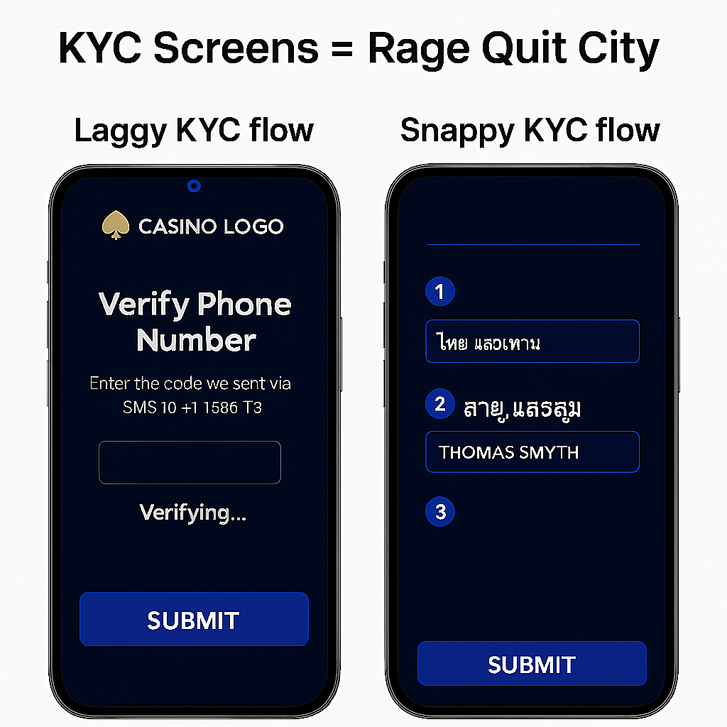
Pro Tip: Optimise every tap. Pre-fill where possible. Compress assets. And test on 3G, not fibre.
What’s at stake?Every second of delay. Every confusing tap. Every “where’s the button?” moment...
It’s not just UX. It’s lost GGR.
Remember that in Asia, every pixel matters. Every second costs. Mobile UX is where CAC either compounds… or goes up in smoke.
What Asia Expects: UX Tips for Maximum Impact
Players in Asia aren’t “browsing.” They’re scanning. Speed-tapping. Chasing dopamine. Your platform either feels instantly intuitive, or it’s dead on arrival.
So, here are some golden rules you should abide by if you want to work in Asia:
Low-Data Mode Ready
Asian players often operate on limited bandwidth and patchy mobile connections. If your site loads like it’s stuck in a PowerPoint presentation, they’re not waiting around.
>> Optimise image weights. Kill unnecessary animations. Make “Lite Mode” the default, not a fallback.
Language Fallbacks That Make Sense
English is not a localisation strategy. Your fallback should feel native, even if it's hybrid.
- Interface in Taglish or local dialect.
- Tooltips with regional slang.
- Bonus descriptions in the player’s own language
Remember, symbols and visuals bridge language faster than perfect grammar.
One-Hand Navigation
If your main CTAs are top-right and tiny, congrats, you’ve just lost every mobile-first player commuting on the metro.
Design for the thumb:
- Bottom tab bars
- Big tap zones
- Infinite scroll over multi-page carousels
- Zero need to rotate to landscape
Wallet Shortcuts
Pre-spin is where 80% of abandonment happens. Cut the cognitive friction. Nobody wants to “explore payment settings.” They want to click and spin.
Here are some smart UX ideas:
- One-tap deposits
- Bonus balances above the wallet icon
- Saved payment methods (like Paytm, GCash, or ShopeePay)
- Visual clarity on “how much I’ll get” after deposit
Quick A/B Tests to Run Before You Scale
Scaling bad UX doesn’t just slow growth, it multiplies cost. So, before you throw more budget at traffic, run these fast experiments.
They take a week but the results will last for quarters.
Localise Game Thumbnails
Test game images with native cultural cues. A dragon-themed slot with regional colour grading outperforms generic “Vegas neon” every time.
Metric to watch: First-click rate in lobby
Add Local Language Taglines to Homepage Banners
Split-test your “Welcome Bonus” with translated CTAs and culturally tuned phrasing.
Even local slang boosts clickthrough.
Metric to watch: Bonus claim rate
Shift Homepage CTA: Bonus-First vs Game-First
Do players click more on “Play Now” or “Claim 100 Free Spins”?
(We’ve seen 3x lift with the bonus-first layout.)
Metric to watch: CTR to deposit page
Reduce Homepage Elements by 30%
Cut clutter. Remove one banner, one nav tab, one block of noise. Simpler layout = more focused action.
Metric to watch: Scroll depth + lobby engagement
Add “Recently Played” + “Top Rated” Filters
Personalisation starts with the obvious. Show players what they clicked, or what others like them are playing.
Metric to watch: Repeat session conversion
You Don’t Have a Traffic Problem…
In Asia’s mobile-first markets, attention is short, expectations are high, and patience is nonexistent. If your first-deposit conversion is tanking:
- It’s probably not your ads.
- It’s not your bonus.
- It’s not even your game portfolio.
It’s your UX. Bad mobile experience isn’t just costing you players.
- It’s bleeding your CAC.
- It’s shrinking your LTV.
- It’s breaking trust before you’ve earned it.
The good news? Fixes are fast.
The results? Long-term.
At Bettorify, we help operators build native UX for long-term operations, which turns into a competitive advantage.
Players don’t care what platform you use. They care how it feels. Let’s make it feel local. Feel fast. Feel easy.
